Context
Copysmith is a startup aiming to provide quality content-writing at an affordable rate for SEO Agencies and e-commerce managers by using the latest technologies in natural language processing. While the mechanics behind the product is complex, the product is fairly simple: Users input a few characteristics about a product or service and Copysmith generates industry-grade copy for marketing and SEO.
Having a successful launch meant that our initial users will have an intuitive way to get their generated copy quickly and effortlessly. I was brought on to co-lead a team of designers to bring to life a product concept within a rapidly evolving market in machine learning.

Project Overview
I collaborated with two designers, our market research, editorial, and software development teams to deliver designs that balanced our diverse set of user needs with rapidly approaching deadlines. Our primary goal for the design team was to create an intuitive and effortless user experience for a new type of product in the marketing landscape.
Time Frame
September ‘20 - October ‘20
My Role
Product Designer, User Research, Design Operations
Team
Founder, Growth, Developers, Editing, Design Team
Design Approach
I began this project by gathering all the research completed by our market research team on our target users. I then met with the product founder and my co-lead to try to unpack our journey from concept to a launchable MVP.

Research Methods
Since much of the product-market-fit research had already been completed through personas and user therapy sessions, I decided to focus on competitive analysis and conducting usability research. Our usability research involved working with our internal editorial team who had been using our product in alpha to determine a smooth and optimal user flow. Most of our research was done alongside our design process.
How might we design a competitive MVP that satisfies user needs in a relatively new market space?
🗣 User Interviews
Interviewed the editorial team to understand the user journey and contexts of writing and editing a blog-post with the Copysmith alpha. Synthesized research into potential pain-points.
📊 Competitive Analysis
Analyzed the products of 10+ competitors to determine what features + design elements were needed to create a competitive MVP upon launch.
📚 Existing Interviews
I also analyzed and referenced the initial survey data collected by our PMF team. We used the personas the team created to establish user goals.
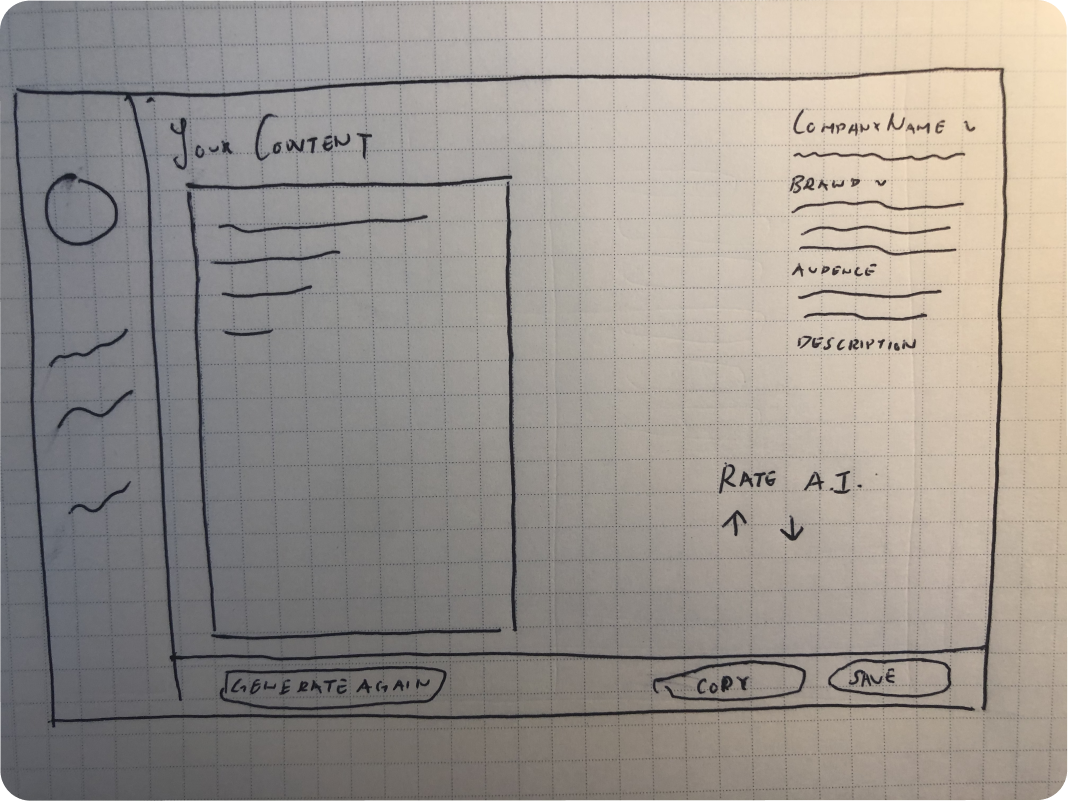
Sketching
I started the project by making sketches for the product to ideate what our product could look like. We iterated upon these sketches through through weekly design reviews where we ensured our user flows reflected an optimal user journey. Outlined below are some of the design decisions and elements I worked on in greater detail.

Generation Page Layout
We came up with a few different designs for the layout of our generation page. One of our first decision-making point arose from whether inputs and generated output should be presented on separate pages.
While my initial sketches and early mockups envisioned two pages for inputs and outputs to limit the amount of text-heavy elements, I decided to explore how we could place both inputs and outputs on the same page to limit the friction of going back and forth between inputs and outputs in case a user wanted to tweak the tone or marketing keyword of their generated outputs.
Two column design
We iterated on a few different versions of a two columned design and settled on this layout for our final design approach.
After I met with some early users of our alpha, we confirmed that our users prioritized a UX that would allow them to rapidly repeat generations with small updates to input parameters.
This experience was also beneficial for our MVP because our language processing model was still being perfected. Having an easy way to regenerate undesired copy was crucial to minimizing the impact of occasional “duds” the AI would produce.
Topography
We needed a visually compact input field that was flexible in layout since Copysmith.ai could generate over 7 different types of marketing content. As such, I designed our layout so that each layer has a defined purpose. Having a structured topography allowed for a diverse range of input combinations while still maintaining visual balance.
We determined our input parameter hierarchies and groupings by following conventions and mental models familiar to marketing and e-commerce professionals.
Copysmith Design System
Based on the market research team’s insights that studied preferences for visual style, most of our target users referred to other SaaS applications to describe their ideal “look” of our app. That meant that our app needed a clean, professional, and consistent feel.
However, since we initially had multiple designers working remotely on separate parts of the app, it became increasingly clear that a shared design language was necessary to maintain consistency and improve usability across our work. That’s when I began working on the Copysmith Design System, which was beneficial for a few reasons. It would allow us to:
Process
I starting the creation of this system by cataloging and auditing all design elements made by our team. I evaluated the usability and accessibility of each element through AA accessibility guidelines and catalogued the most flexible elements that we’d use most frequently. After checking in with the team to be aligned on our design conventions, I made sure that each element adhered to an 8x8 grid system with pixel precision so swapped component-instances in Figma would create seamless transitions for rapid prototyping.
While creating and maintaining this component library was admittedly difficult and time-consuming at first, making use of this component library significantly improved our ability to rapidly update and iterate our prototypes.
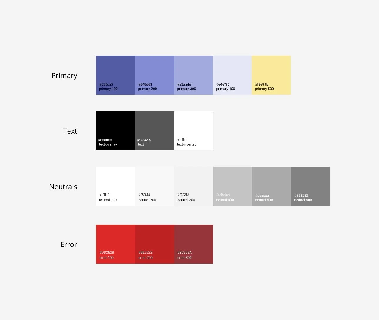
Color
Towards the beginning of our project, I realized that our color palette involved an equal visual balance of magenta, tan, black and a bright red.
As the project progressed, I also noticed that each color wasn’t assigned a specific purpose across the site, which meant that a bright red button could be a link, confirm or a delete button at the same time.
I sought to provide meaning and purpose to our brand colors and laid out a color scheme that began to define function and consistency across our designs.
Typography
I applied a similar process with our typography where I sought to create a heading system where each type category served different functions. Creating these type styles in Figma was particularly useful when we wanted to change our font system-wide. Having this system allowed us to propagate a product-wide body-text change with a few clicks.
State Changes
After being inspired by Nathan Curtis’ article on button edge cases, I decided to iron out different user edge-cases by creating multiple different “states” for each button we had. It seemed strange to spend an entire afternoon working exclusively on buttons, but my work paid off when each state change was carefully documented for both prototyping and development.
I applied the same philosophy to our text fields and also began applying our typography conventions to our text labels.
This was my first time creating a design system for a product of this complexity, and I found it incredibly useful from a usability and design operations perspective to know how design elements should behave in a variety of different contexts. As someone who’s design expertise leans towards UX over UI, I also gained valuable experience in creating pixel perfect designs.

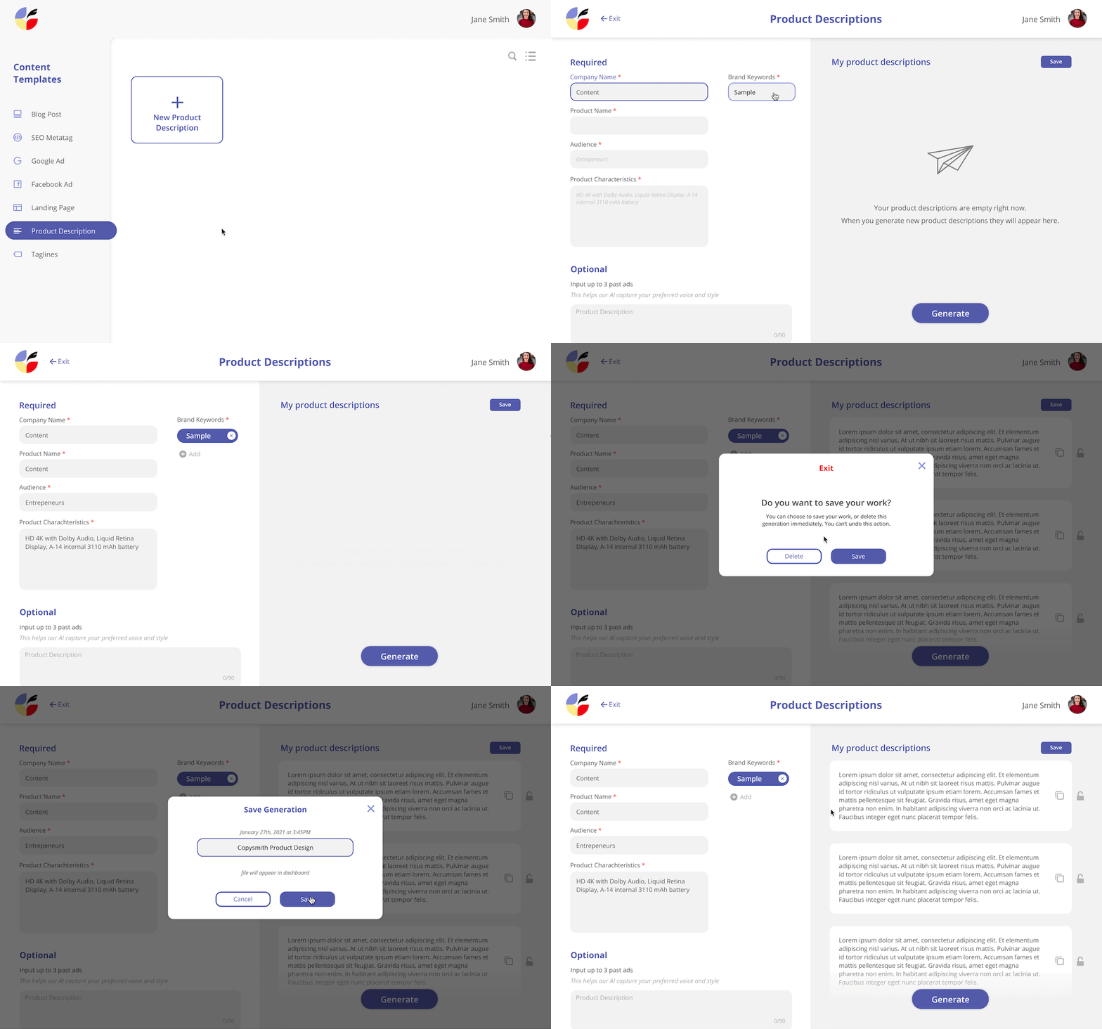
Saved Work Tradeoffs
To make our product competitive amongst other language processing products (at the time), we decided to create a way for users to save their work. Incorporating this feature into the MVP was also important as it was the first step towards creating a system for organizing files into campaigns. (This would happen later on down the product strategy timeline).
While designing this system, we envisioned two different task flows for creating and saving a product.
The first task flow involves the user naming their file before generating content. After naming the file via modal, the user would generate content, then save their work, and return back to their dashboard to see their saved generation. We found that this taskflow would primarily benefit those who were more likely to save and return back to their work frequently.
The second task flow follows a Figma/Google Suite convention of creating and naming work. Users can generate content as soon as they navigate to the tool and save/name their work on their way out. The main benefit of this taskflow lies in one less modal flow as both saving and naming the work would happen in conjunction.
We chose the second taskflow in our final UX approach for two main reasons:
We believed that intent to name is intent to save, and that we shouldn’t require users to go through the process of naming their work if they have no intention of returning to it.
Having reduced friction towards the beginning of the taskflow was more desirable in the context of where our product was at in our product lifecycle. As part of our MVP launch, our goal was to get as many people to quickly try and see how well our product generates content. Since this MVP has a demonstrative element to its release, we wanted our users to get to the core of our product as quickly as possible.
Reflections
I had a few personal goals in mind when I joined Copysmith.ai— I wanted to get more comfortable working in a cross-functional team while improving my communication skills, increase both efficiency and quality of my UI designs and get a better overall understanding of how to ship a product.
Throughout this project, I felt as if I significantly improved my skills in each of these areas.
In regards to communication, I learned that good communication isn’t simply a byproduct of a well-structured organization, but is something that needs to be consistently prioritized and initiated on an individual basis. I felt that instead, a well-structured organization is in-fact a byproduct of strong communication
In regards to improving efficiency and quality of UI design, I learned that UI work is more efficient when paired with a strongly defined UX. There were moments where a significant amount of time was invested into changing things at a UI level, but I realized that stepping back and re-crafting better UX allowed for a quicker UI redesign.
This was my first time being a part of a product launch, and I learned that it’s important to have clarity on which features should be incorporated at different iterations. Trying to pack all potential features into an MVP was overwhelming, so prioritizing features was key to maintaining our launch timeline.

Outcomes
Do I consider this project successful? The answer is yes.
I improved in the skills I sought out and Copysmith reached #2 on product hunt (check us out!)
While I would have loved to stay on the team to work on Copysmith’s second iteration, I left the team to work on an MVP for a different stealth startup.
Thanks for reading :)


