Context
In March of 2022, the loyalty team at Slickdeals was tasked with increasing the user-base of loyalty users within our overall ecosystem. While allowing Slickdeals users to shop with cashback has been a promising avenue to acquire loyalty users since the beginning of the program in 2020, there was a strong will at the company to further our acquistion efforts to cement our existing momentum and mature our Cashback product from a promising beta to a fully-fledged product.
After having a coffee & chat with my new product manager, we agreed that we needed a UX refresh on many of our product surfaces on the site if we were to have a large influx of users after discovering that critical aspects of our program were hard to understand for a sizeable group of users. Since Cashback Rewards of old was an MVP experience that was built with as little dev effort as possible, I wanted to explore a UX strategy that was fresh, flexible and robust.
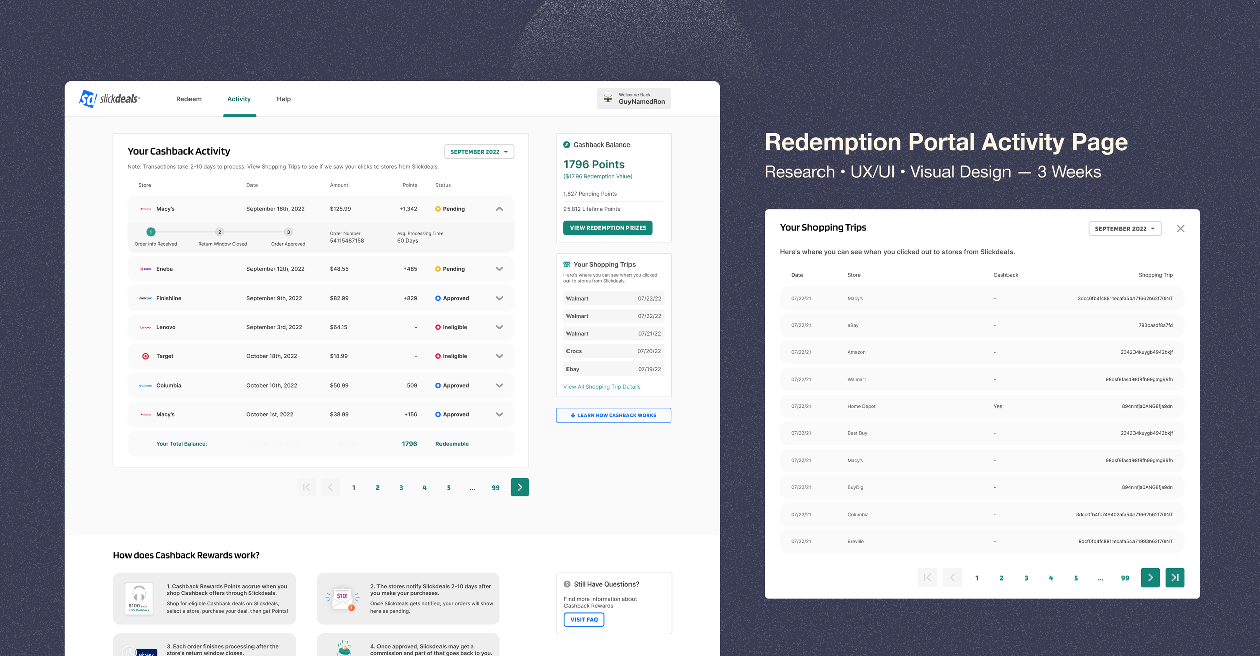
For this particular case-study, I’ll be delving into the activity page of the redemption portal — a surface of the product where users can track their cashback transactions to see whether they’d finish paying out.
Problem statement
— How might we help users understand the processing times of their Cashback Transactions?
Project Overview
My Role
UX Research
UX Design
Visual Design
Product Strategy
Timeline
3 Weeks
(1.5 Sprints)
Collaborators
Product Managers
Internal & External Development Team
Design Team
Product Lifecycle Team
Tools Used
SurveyMonkey
UserInterviews.com
Tableau
Research
This project began with some insights from past research which suggested that 43% of our users did not find the processing times of Cashback approvals easy to understand. In addition with this insight, I conducted additional general sentiment survey to inform our new strategy. I took a look at this research (user interviews, surveys & competitive analysis) to inform more specific aspects of the redemption experience.
User Journey
Through our research, I created a user journey map to help us understand what information needs to be prioritized at the relevant stage of the experience. Since checking the redemption portal to verify cashback approvals existed in the middle of the journey, we wanted to prioritize information that would be useful to know during and after confirmation while excluding information that was not relevant to this part of the journey.
Big Picture Insights
In addition to the user journey, I focused on some major themes from user interviews that was centered around redemption experiences.
4/5 users were already familiar with cashback programs from our competitors.
However, they wanted clear and fast updates about their cashback transactions.
Half of our users found processing times for cashback payout confusing.
These three points would inform our high level design strategy for this project.
High-Level Strategic Design Improvements
Based on these High Level Insights, my overall strategy became clear. I then worked with my product manager to determine the key performance metrics to measure the success of our strategy.
Match expectations of redemption patterns and flows to the mental model of our users.
This way, users can utilize past cashback experience for a more intuitive Slickdeals experience.
KPI: Increased Redemption Activity — Total number of visits / unique visitors per month
Provide better hierarchy of transaction statuses for cashback purchases.
Allow users to find the information they need quickly and effectively.
KPI: YoY reduction in search queries of processing related FAQ searches.
Improve messaging, context and design of transaction statuses.
Once they find the high-level information they need, know the deeper function of each feature.
KPI: YoY reduction in search queries of processing related FAQ searches.
After defining these improvement areas, I began to take a look at the existing design.
Activity Page Redesign
The Activity Page is where users can track whether their cashback payout has posted. Our users shared a common experience of visiting this page when a cashback transaction was pending, which means that after the user had made a purchase — they weren’t able to receive their cashback due to the ongoing return window of the merchant. We determined that this was very high impact page to improve our KPI’s and thus prioritized its design and development.
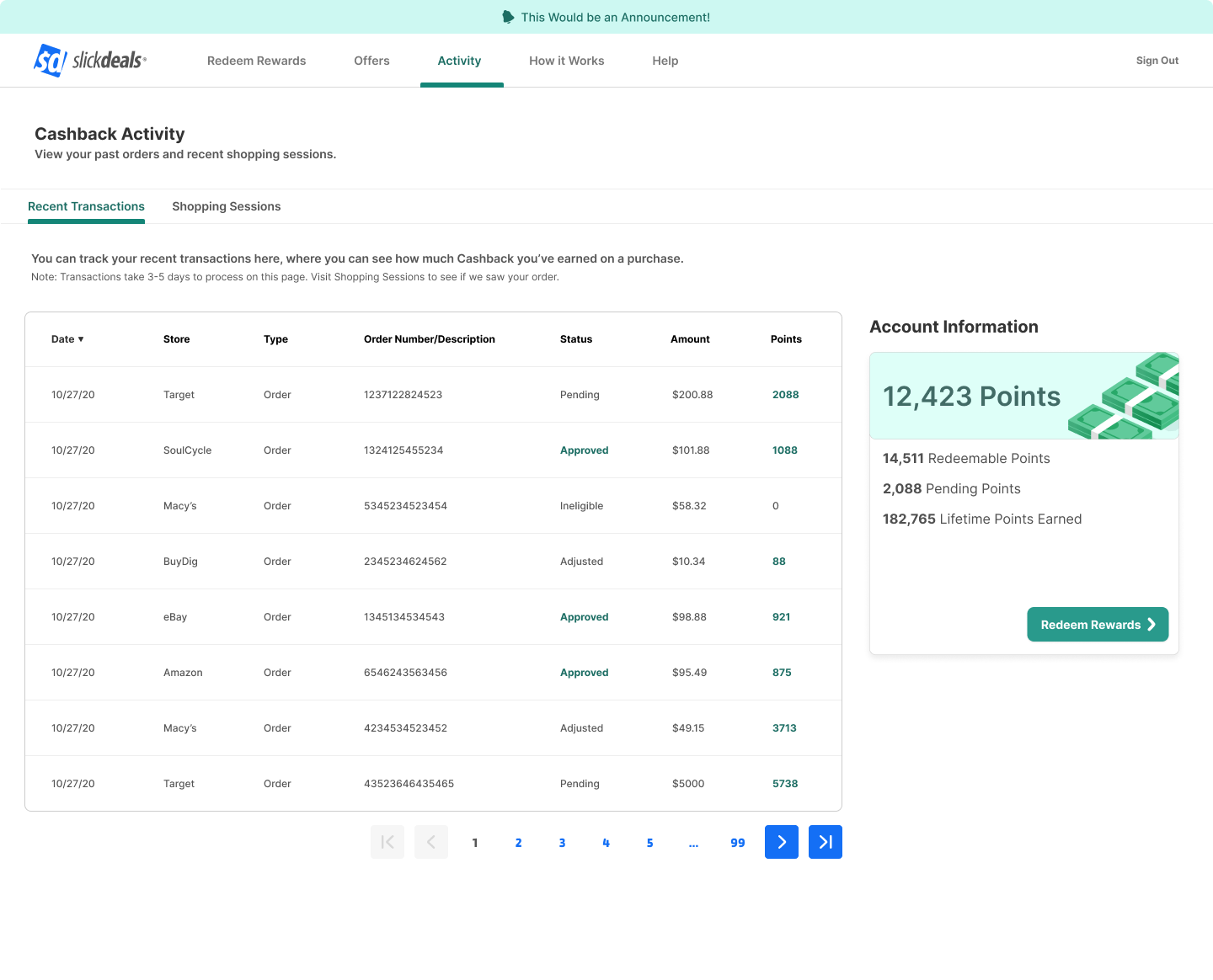
Critique of the Old Design
The landscape prior to the redesign consisted of features expressed through a hierarchy defined in its 2020 launch. I sat down to assess the problem areas that were no longer compatible of our new strategy.
Rows on orders does not have a clear information hierarchy.
Previously a clutter of information that doesn’t prioritize status information that the user wants.Shopping sessions tab is unclear as to what the user can go there to do or learn.
This feature displays shopping outclicks meant to rectify the 3-day period for transactions to initially appear on the page.Messaging copy about transactions is confusing.
Much of the copy states the obvious and wastes real estate which could provide more relevant information.
Improving Information Hierarchy
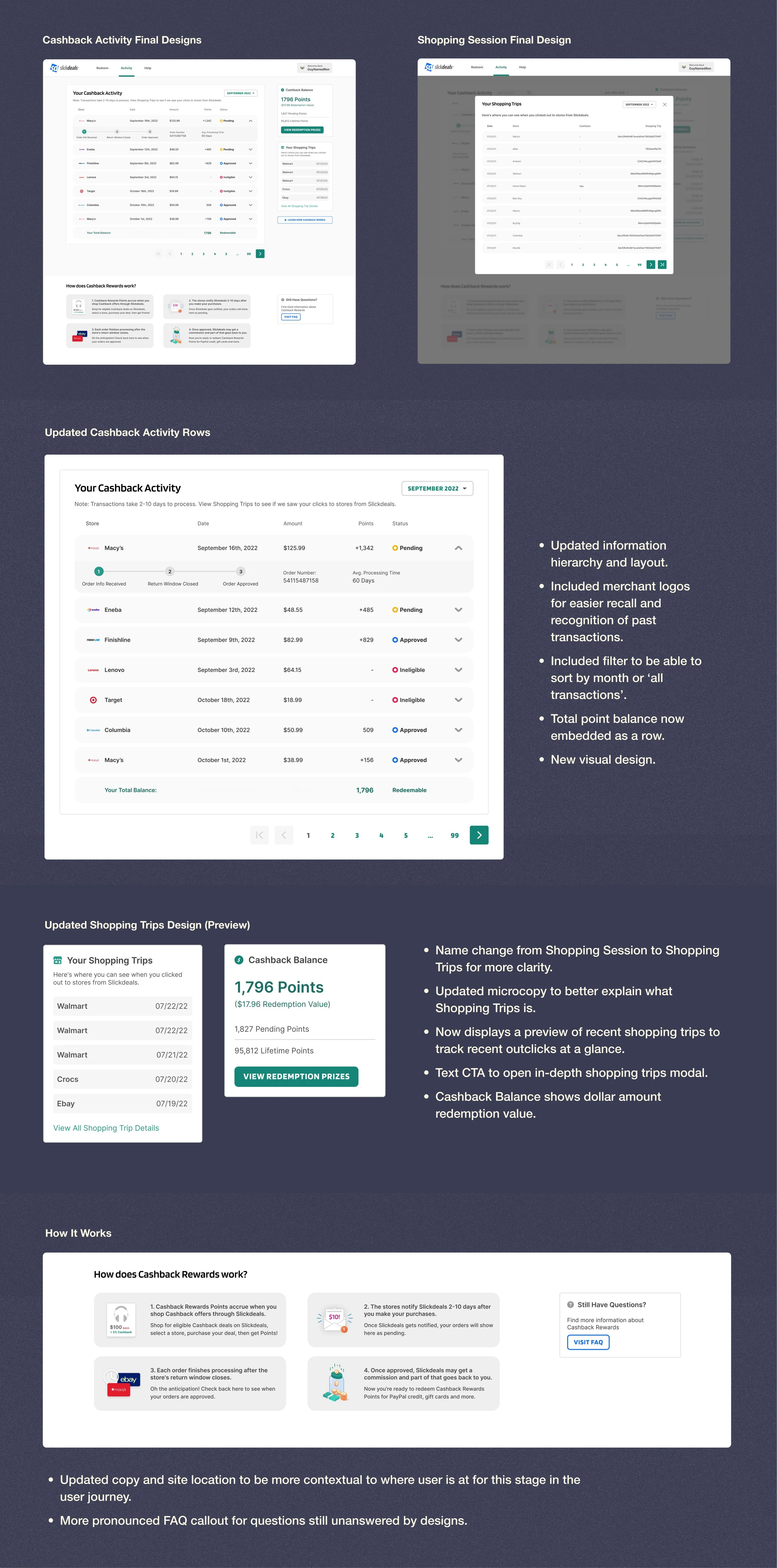
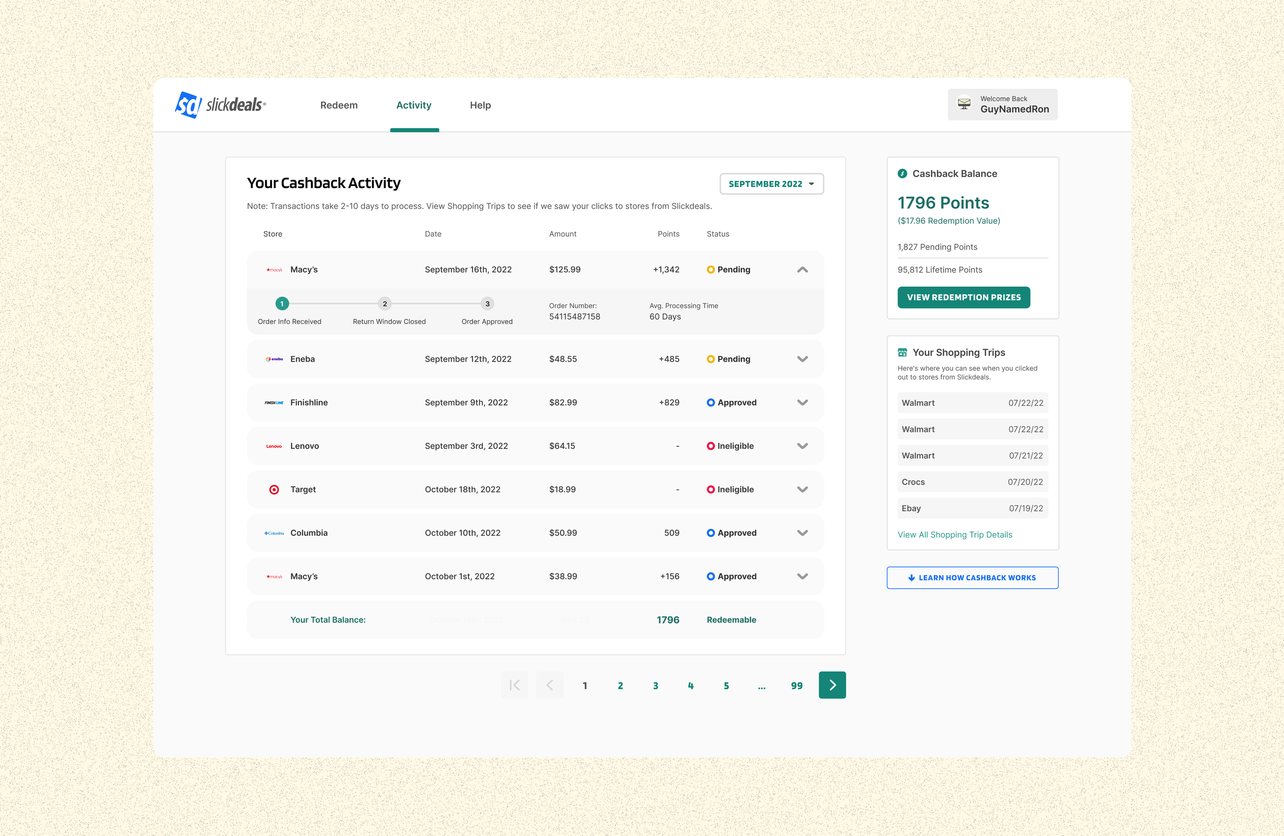
The first task at hand was to redesign the layout of the page. After I created a few visual explorations, I had a few rounds of design crits with my product and design team. After deliberation, I landed on this layout with an information hierarchy that prioritized the mental model of our users: they would view their points balance and recent transactions, then look for additional information to provide context to the prior information.
If they weren’t able to find the information they needed in the first couple of steps, I would then provide the option of viewing their shopping sessions to ensure we successfully recorded their out-click. Lastly, we would repurpose the “how it works” tab on the old experience to provide more context directly on this page to how cashback transactions get processed in our system as an educational piece.
Improving Messaging, Context and Design of Transactions
Now that the structure of the layout had been defined, there was on opportunity to improve things on a more granular component level. As mentioned earlier, each row of transactions did not have a clear hierarchy of information that best prioritized information what users wanted to see.
Here is a simplified, closer look at the old experience.
Some thoughts came to mind: Does order value/description provide valuable information to the users? What does type mean categorically? Do users remember by date of transaction more than the store they recently purchased something at?
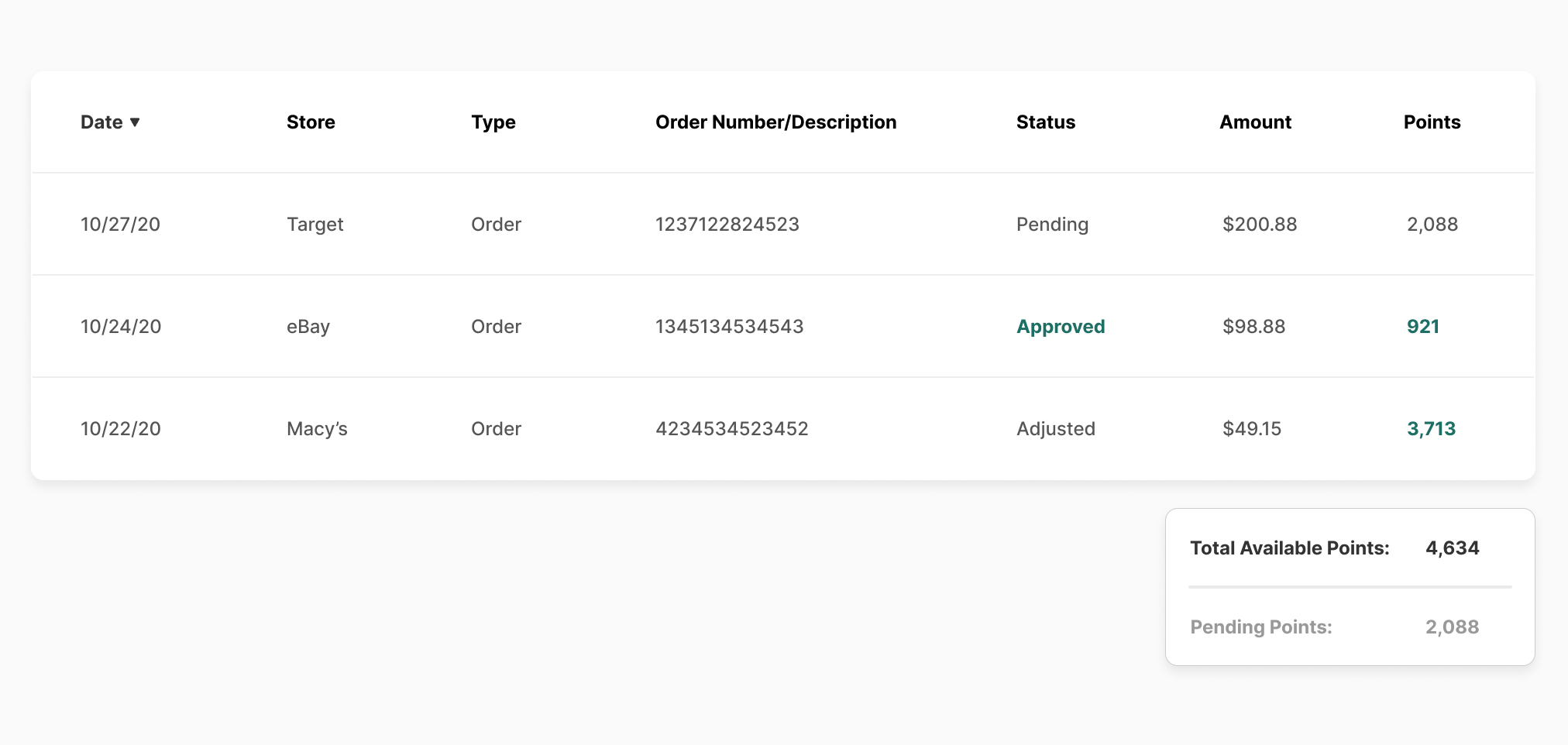
Updated Row Design V1
The first pass of this design attempted to only include the most relevant pieces of information in the order that a user would try to remember and determine a transaction status. However, after our conversations with our dev, legal, and support team, I discovered that I still needed to include more specific order information so that users could submit support tickets on transactions. I also felt that important contextual information was still missing as to what pending, approved, and ineligible could mean. This meant that I needed to include a lot more information into these rows.
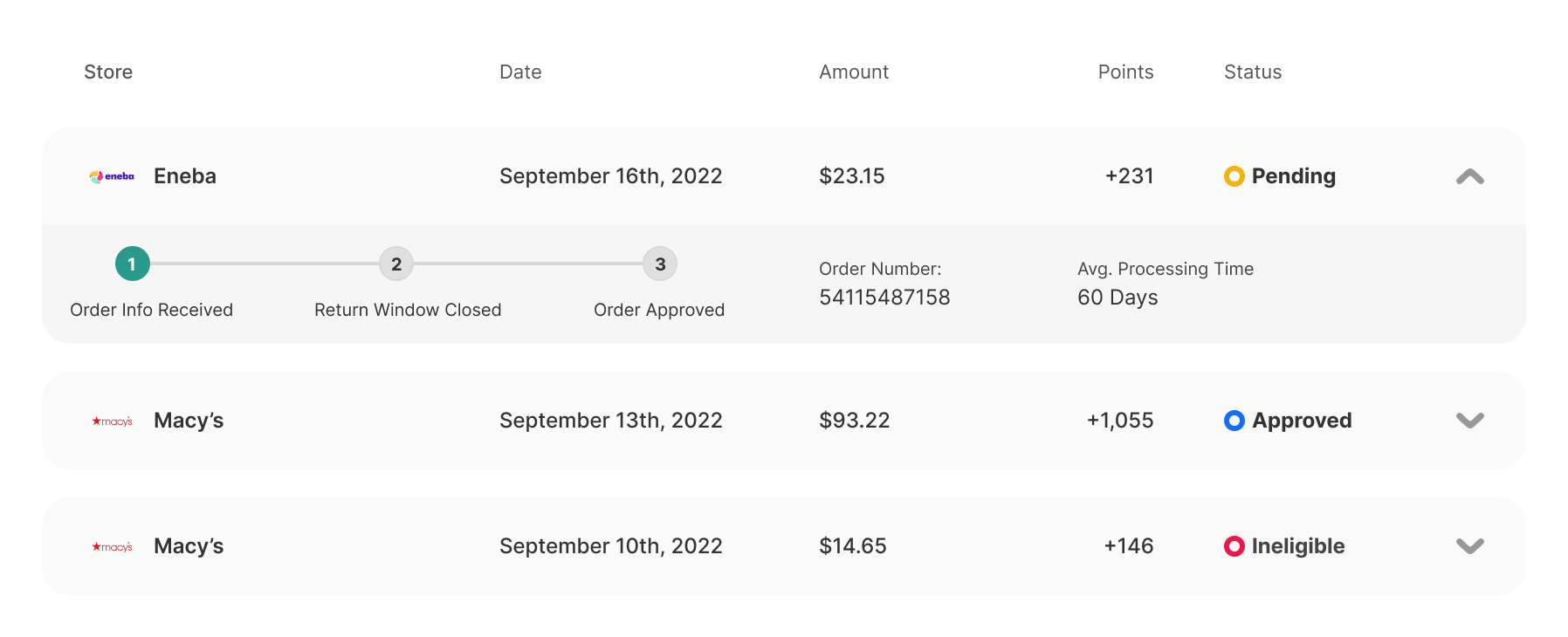
Updated Row Design V2
I then proposed this design solution. I found that the progressive disclosure provided a good balance of keeping things simple at a glance, but being able to delve deeper into more information.
Once opened, users can see a step-by-step process of what steps are needed for a transaction to process. I then included order number for support tickets inquiries and later added an average processing time displayed prominently so that users could know what to expect as a timeline.
Activity Page Final Design Solution
After defining the layout, hierarchy and component level designs, I combined them into our final design solution which was developed in phases in Q4, 2022.
Setbacks and Challenges
One of the main challenges of this design approach was trying to account for every single transaction state for each row. While the initial goal was to simplify the status options to just approved, pending, and inelligible states for simplicity— there were some technical challenges with reducing the amount of statues as certain transaction situations were highly specific and unique.
While this wasn’t my ideal design solution, these states were accounted for by creating new row states with additional context and information in the expanded state. In the future, I would like to revisit these states with our dev team to see if there are other alternatives to message edge-case scenarios without compromising status clarity.
Performance Results — and digging deeper.
So how has the updated design perform so far? Let’s revisit our initial KPI’s.
Reduction in YoY (Year-over-Year) search queries for processing related FAQ’s.
After the full experience launched on November 1st, 2022 — we saw a 15% reduction in YoY at the end of November, and a 10% reduction at the end of December.
Increased redemption portal activity
This number is still opaque to us as the data pipelines for this information must be manually pulled. Our data team was not available to determine this by time of writing this case-study.
Revising Metrics
Upon reflection of our KPI’s, I realized that the best way to measure the performance of this page would be to run our initial sentiment once again to see if the problem of users not understanding processing times would be solved by the updated designs. However, we sent our first NPS survey at the end of Q4 so though we do not have comparative data, we did receive some qualitative feedback regarding the experience at hand.
Positive Feedback: ”It's easy to use and fun to watch the cash add up.”
Negative Feedback: “More clarity and communication on progress of claimed rewards. Seems like always have to chase.”
Retrospective
Iterations
While this was a first pass iteration at making the redemption portal experience more clear, there are still more opportunities to improve the experience of the Redemptions overall. One thing to note is that the improvements to this experience will help us understand how to communicate redemptions and processing times across the website as work is still needed to explain the rewards ecosystem outside of the redemption portal. Another piece of feedback we discovered in our NPS survey was the lack of intuitive ingress flows into this particular experience. Once these ingress flows are established, work is needed to ensure the landing experience on the page is intuitive.
Next Steps
Further testing of the designs to determine performance of designs with more granularity.
After designs were shipped, new opportunities had arisen to make further improvements to the design. Although our overall goal was to help reduce support tickets, adding ways for users to “close the loop” and discover deals and cashback offers is a future design improvement we’d like to make.
Despite trying our best to communicate the context of cashback of processing times, nothing beats a user experience where pay-out times are inherently far shorter. As such, I discussed an idea with my product manager to provide faster payout times for smaller cashback payouts. This would significantly improve user satisfaction while minimizing cashback liability for the business. This idea will be explored further in Q1 2023, which may require changes to the way we communicate how payout times are processed.
Our design team had recently discussed improvements to the design system in 2023, which involve changes to typography, CTA designs and color semantics. Once these changes are rolled out, I will update these designs to be up to date with our upcoming design system.

