Multi-Department Project
For this opportunity, our team worked with the Digital Services Department and the Department of Public Health. We worked most closely with Linda Acosta, who is the head of the Digital Services Department. Linda and her team were on a mission to transition all SF city government websites to a new and improved sf.gov design system.
To accomplish this, the digital services department conducted over a year of research to develop a design system that's flexible across multiple city departments while still being easy to use.
Our task was to work with the Public Health Department to create an HIV resources page using the new and improved sf.gov design system.
Our Challenge:
SFDPH needs a way for the city's uninsured residents to easily access all public HIV and AIDS services.
How might we craft an intuitive UX flow that encompasses, organizes, and summarizes all publicly funded resources on HIV?

Capturing the Groundwork
Working with SFDPH affiliates to ensure their community work is highlighted.
San Francisco's publicly funded non-profits have a decorated history of combating HIV and AIDS on the ground. Our webpage would give uninsured residents the ability to find HIV/AIDS resources provided by these non-profits.
After speaking with Linda and five non-profit representatives, it was quickly apparent that we'd need to 1) create and organize an inventory on public resources and 2) craft an intuitive UX flow where users can effortlessly find what they need. My UX partner and I decided to tackle one of each task. I would take on the UX Flow and my partner would work on creating and organizing all resources.
Seemingly Simple, But Complex
User Goals
With the UX flows that I'd create, the goals that I established with our clients revolved around easily finding personalized resources and finding local affiliates.
Goal #1: Find information & resources on HIV treatment and prevention
Goal #2: Learn about public initiatives and announcements about HIV
Goal #3: Learn more about local non-profits
Learning From Our Users
Key Insights from Secondary Research
To learn about uninsured residents in need of public HIV resources, I spoke with non-profit representatives and analyzed epidemiological-impact reports sent to us by the city health department. I then created a synthesized report to share my findings with the team.
Insight #1
Structurally Disadvantaged Userbase
Residents of San Francisco who had high rates of HIV+ and were uninsured were likely to have additional complications that made getting treatment difficult. These complications included being financially disadvantaged, limited access to medical casework, substance use, and mental health challenges.
Result: Our website would need to collate and highlight resources that are indirectly related to HIV treatment and prevention. Our clients also suggested that we organize identity and situation-based resources.
Insight #2
Assume Low-Bandwidth
Areas in San Francisco with high rates of HIV-infection also coincided with areas with noticeably worse cell-bandwidth. This is also significant because most of the client's homeless constituents seek online resources from a cellular device.
Result: Our information hierarchy would need to be limited to two pages maximum to ensure that users can find what they need without entering a tunnel of pages.
From Insights to Architecture
Organizing Resources into Intuitive Categories
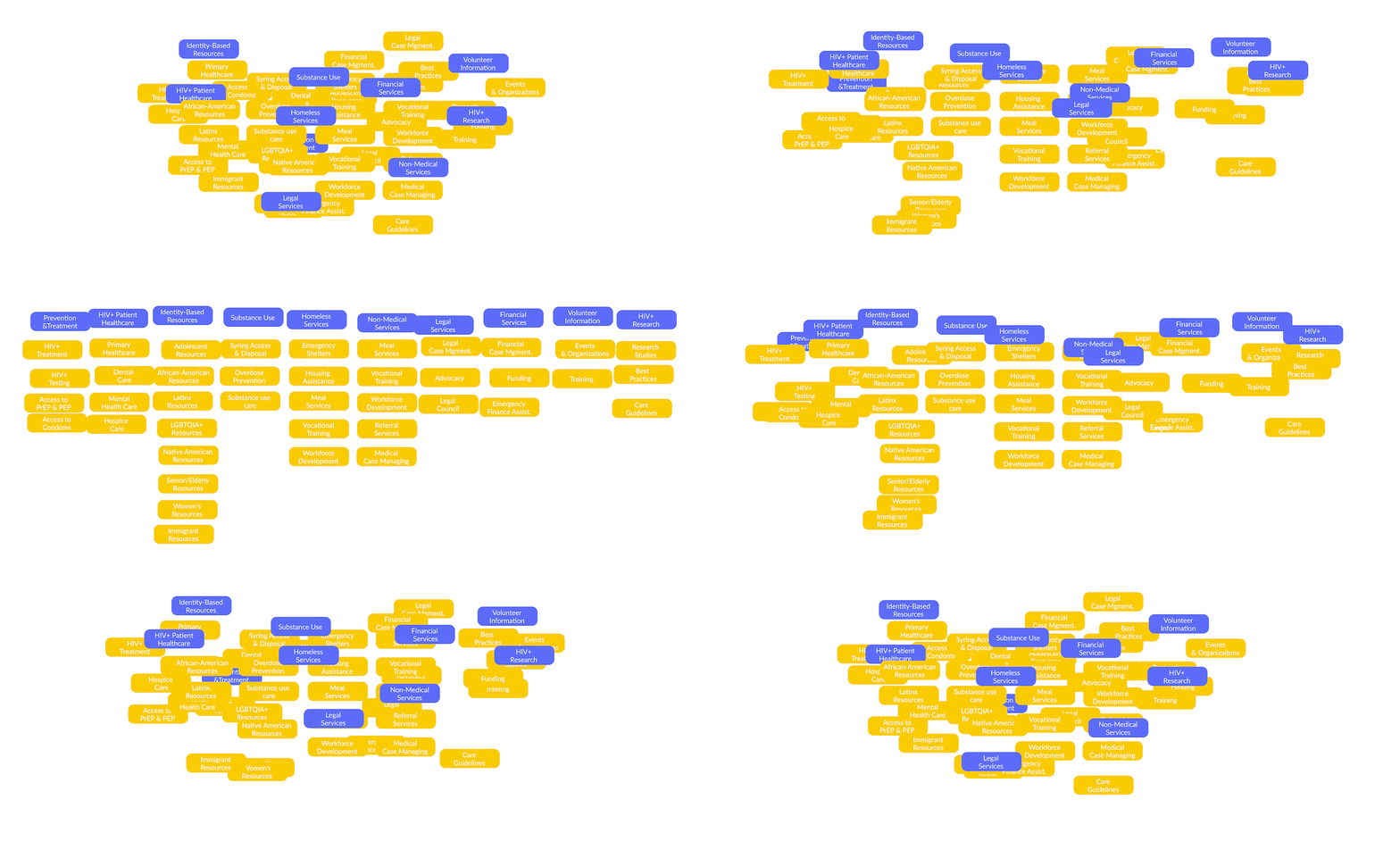
For the final piece of the research phase, our team conducted a series of open card-sorts with local residents to see how users psychologically associated the services we cataloged.
Turning Scribbles To Prototypes
Constructing the Solution
With all my research and our defined information architecture in mind, I started building our site. Beginning with some rough sketches on paper, I drew up some ideas on a sketchbook, sought feedback from my teammates, and then brought the final ideations to life in Figma.
Change #1
Refined Terminology
From our usability testing, 70% of testers would search through other categories before selecting the right one when asked to "Find Mental Healthcare" or "Emergency Financial Assistance".
After refining the labels, the correct buttons were more obvious.
Change #2
Creating Quicklinks
A "frequently visited link box" was added for easy access to common search items. We determined that this would be faster for most users, as they no longer have to access secondary pages to get what they need. I made space for this element by changing our health alert box into a horizontal banner above the hero image.
Now That It Works, Make It Mobile
Designing The Mobile Solution
A central task for this project was to create a design that also worked for mobile devices. Thankfully, the new SF.gov design system was built to be easily convertible to mobile devices.

Category Page
Clear & Simple Information
Once residents arrived at each resource category, they’d need an intuitive way to find their resources. As such, I designed a layout that provides descriptions for each resource to make clear what the user would be clicking on. This allows users to know what they're clicking into, which minimizes time spent finding what they need.
Final Thoughts
A Spectacular Start
In the end, the team was extremely proud of the page we created in a two-week sprint. With another week to refine some edge use-cases (researchers finding public health documentation), it could have been a really comprehensive prototype. Our clients spoke high praises for our work and were enthusiastic about bringing our work to be reviewed at large by the digital services department.
“Thank you guys for your thoughtful approach to this project. I'm excited to show your work to the team and our affiliates for their thoughts.”
Linda Acosta, Head of Digital Services
Feedback on the design? Want to chat over coffee about building a health page? Feel free to get in touch.


