Modernizing Cashback Tracking
UX Strategy for Slickdeals Cashback Rewards
Context
In March of 2022, the loyalty team at Slickdeals was focused on growing adoption of its loyalty features across the broader ecosystem. Cashback had proven to be an effective acquisition lever since its launch in 2020, but there was growing alignment internally that the product needed to mature beyond its beta roots and better support long-term adoption.
After aligning with my product manager, we identified the need for a UX refresh across several key surfaces. Research indicated that core aspects of the Cashback experience were difficult for a meaningful portion of users to understand. Because Cashback Rewards was originally built as a lightweight MVP, this work created space to rethink the experience with a more intentional, flexible, and durable UX strategy.
This case study focuses specifically on the Activity Page within the redemption portal, a critical surface where users track cashback transactions and build confidence around when payouts will complete.
Problem Statement
How might we help users better understand the processing times of their cashback transactions?
Project Overview
My Role
- UX Research
- UX Design
- Visual Design
- Product Strategy
Timeline
3 weeks (1.5 sprints)
Collaborators
- Product Managers
- Internal & External Development Teams
- Design Team
- Product Lifecycle Team
Tools Used
- SurveyMonkey
- UserInterviews.com
- Tableau
Research
Research showed that 43% of users struggled to understand cashback approval processing times. To build on this signal, I ran additional sentiment surveys and synthesized existing user interviews, survey data, and competitive analysis to shape a more focused redemption strategy.
User Journey
I created a user journey map to clarify which information mattered most at each stage of the experience. Because the redemption portal sits mid-journey—after purchase but before payout—we focused on surfacing information that reinforced confirmation and reassurance, while stripping away details that did not meaningfully support that moment.
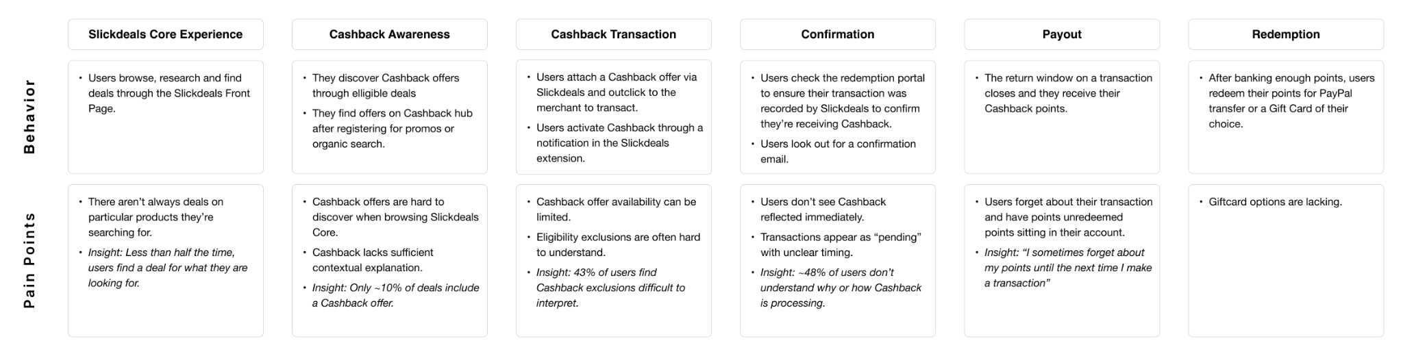
Key Insights
- 4 out of 5 users were already familiar with cashback programs from competitors, meaning expectations were largely shaped by prior experiences elsewhere rather than by Slickdeals-specific conventions
- Users wanted clear and fast updates on cashback transactions, especially during the waiting period between purchase and approval, when uncertainty was highest
- 50% of users found payout processing times confusing, often unsure whether delays were expected, whether action was required, or whether something had gone wrong
Strategy & Success Metrics
Strategic Design Goals
1. Align redemption flows with user mental models
Design redemption to follow familiar cashback patterns, minimizing explanation and cognitive load at key moments.
KPI: Reduction in repeat visits to the same transaction state within a defined window
2. Improve hierarchy of transaction statuses
Reorder and simplify transaction information so users can immediately understand where their cashback stands without scanning dense or secondary details.
KPI: Decrease in time-to-first-status comprehension and reduction in misinterpreted transaction states reported to support
3. Clarify messaging and contextual education
Provide timely, plain-language explanations that answer common questions about delays, eligibility, and next steps directly within the Activity Page.
KPI: Reduction in processing-related support tickets per active cashback user and increased self-serve resolution

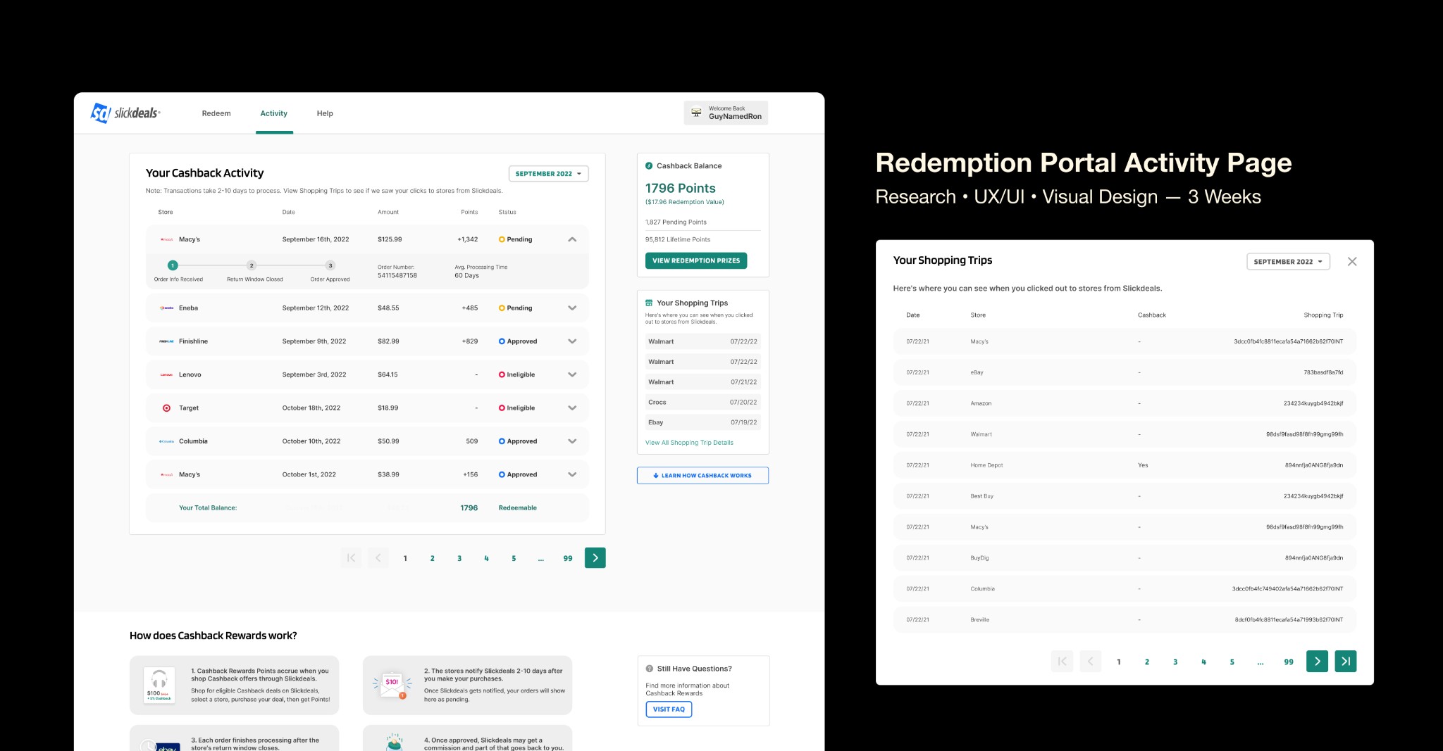
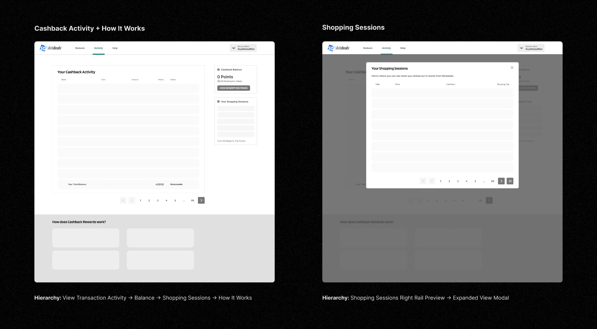
Activity Page Redesign
The Activity Page is where users go to understand whether cashback has posted to their account. Usage patterns showed that this page was revisited most often when transactions were pending, typically during merchant return windows. In those moments, users were looking for reassurance, confirmation, and a clear sense of what would happen next.
That behavior made the Activity Page a high-leverage surface. Improving clarity here meant addressing uncertainty at its peak, rather than relying on secondary education or support channels.
Critique of the Existing Experience
Despite its importance, the existing Activity Page reflected assumptions from its 2020 launch and had not kept pace with user expectations or program complexity.
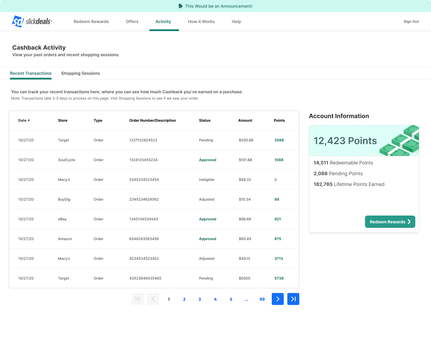
Key issues identified:
- Transaction rows lacked a clear information hierarchy
- Status signals were buried among secondary details
- The Shopping Sessions tab felt disconnected from user intent
- Transaction messaging was verbose and repetitive
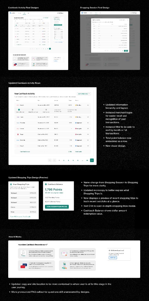
Improving Information Hierarchy
- Points balance and recent transactions
- Contextual information explaining transaction status
- Shopping sessions as a fallback for out-click verification
- Embedded education explaining how cashback processing works
Improving Transaction Rows
Now that the structure of the layout had been defined, there was on opportunity to improve things on a more granular component level. As mentioned earlier, each row of transactions did not have a clear hierarchy of information that best prioritized information what users wanted to see. Here is a simplified, closer look at the old experience.
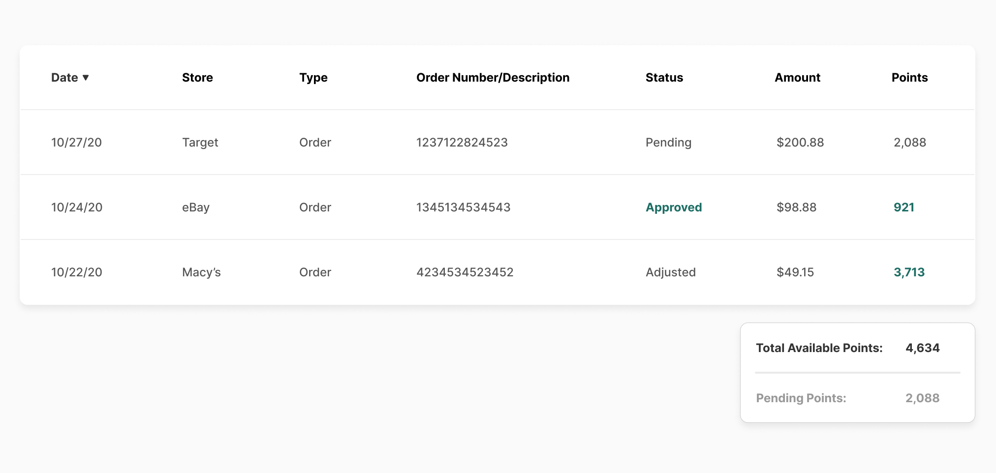
Final Row Design
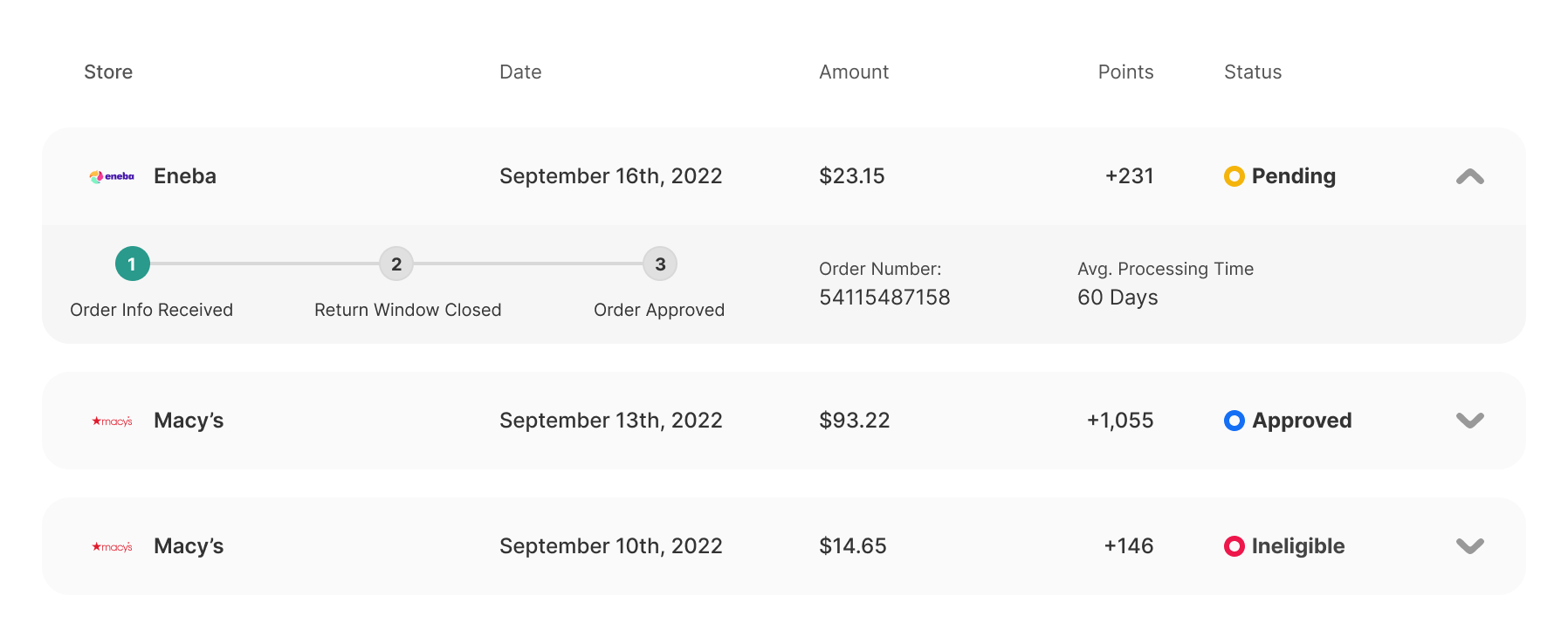
The initial design prioritized minimal, status-focused information, but reviews with engineering, legal, and support revealed gaps around order details and status clarity.
The final iteration uses progressive disclosure to keep the default view simple while exposing step-by-step processing details, order numbers for support, and a clear average processing timeline when expanded.
Final Design Solution
Results & Impact
So how did the updated design perform?
Revisiting our initial KPIs, we saw early signals of improvement. After the full experience launched on November 1, 2022, year-over-year searches related to Cashback processing FAQs dropped by 15% by the end of November and 10% by the end of December, suggesting improved clarity around transaction status.
We also aimed to measure increased engagement with the redemption portal, but this metric remained difficult to quantify. At the time of writing, the data required manual pulls and our data team was unavailable to support a deeper analysis.
Revisiting the metrics
In retrospect, the most direct way to evaluate success would have been to rerun our original sentiment study to see whether confusion around processing timelines had meaningfully decreased. While we lacked a pre-post comparison, our first NPS survey at the end of Q4 did surface relevant qualitative feedback.
Positive feedback highlighted ease of use and a sense of progress, while negative feedback reinforced that some users still wanted clearer communication around reward status. Together, these responses helped frame the next iteration of improvements rather than positioning this work as a final solution.
Results Dashboard / Metrics
1200 x 500pxNext Steps
- Deeper performance testing
- Faster payout exploration
- Design system alignment